It is always fun looking at old work you have done a long time ago, isn’t it? In my case it is a site that was used on my old playground www.stargazer.at, where everything started.
One of the problems of the old times are those rollover effects used with buttons which were used to be preloaded using Java Script code, which used to be a pain in the ass as it was not beautiful nor compatible.
Nowadays we know better ways doing the whole thing without that suicide runs in Java Script – and this is one of them:
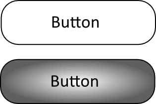
Let’s imagine a button having two states, being two images we need to exchange. It is the same problem we used to have back in the old days:

And this is the second image, the button being pressed:

Putting things to code, our css style could look like that:
#foo .nav li a { display:block; height:211px; float:left; }
#foo .nav li a.menu:hover { background:url(button-b.png) no-repeat; }
#foo .nav li a.menu { background:url(button-a.png) no-repeat; }
#foo .nav li a.menuSel { background:url(button-b.png) no-repeat; }
The code isn’t beautiful as a common browser does not load images which are not used. So we need to be creative. My little idea is trying to play with picture alignment. For doing so, I’m combining the button images:

And now let’s do some magic: I am using the same image for all of the button states, I just shift it using alignment. Due to my fixed height, there is some ‘overflow’ part of the image which is just not shown:
#foo .nav li a { display:block; height:211px; float:left; }
#foo .nav li a.home:hover { background:url(../images/button-ab.png) left bottom no-repeat; }
#foo .nav li a.home { background:url(../images/button-ab.png) left top no-repeat; }
#foo .nav li a.homeSel { background:url(../images/button-ab.png) left bottom no-repeat; }
The result is a nice button working as expected having the big advantage that it is more or less cross browser compatible without a single line Java Script.